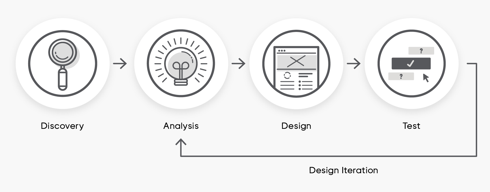
The Design Process
UX Questionnaire
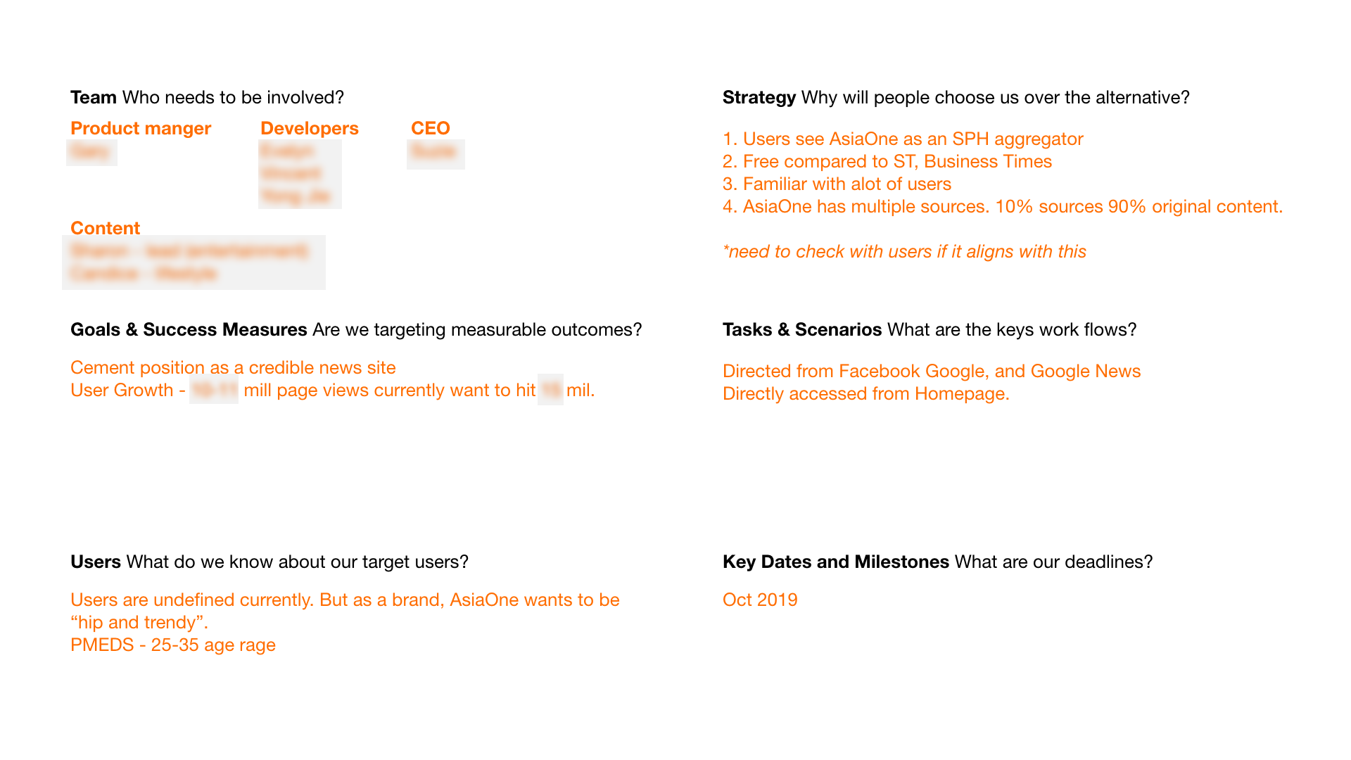
To kick off the project I conducted a UX questionnaire with the AsiaOne Team. This helps to clarify goals and at a high level to I know what I'm designing for and why. This process also gets me thinking about what work still needs to be done and what the future steps might be.
UX Expert Evaluations
As part of the analysis process, I conducted an initial evaluation to view the website under a critical lens to identify any room for improvement, outstanding issues or red flags.
Here is a summary of the issues found:
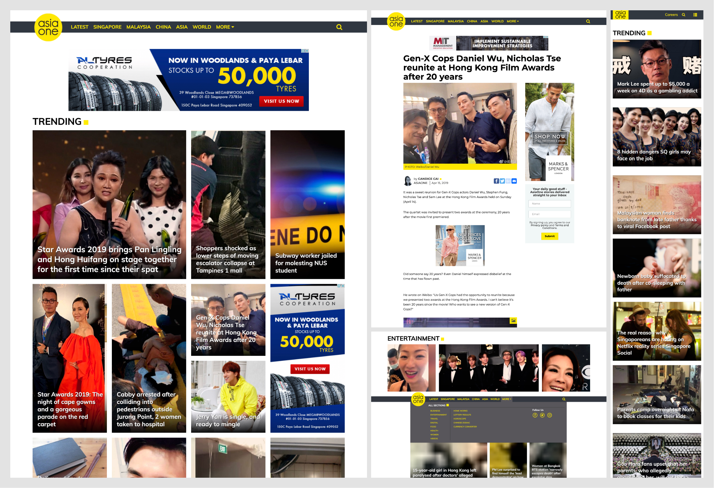
- Homepage was particularly inefficient in providing what type of content AsiaOne had to offer.
- The inconsistent article grid and atypical image ratios led to pixelated images and key visuals being cut off. (only applicable for desktop).
- Inconsistencies of clickable header links to subpages.
- No insight to the article category until clicked into.
- Additional Services header that have links to “Currency Converters”, “Horoscopes” and “Chinese Zodiac” are unrelated to news. Might be interesting content but seems out of place in the homepage of a news website and might affect the credibility of the website.
- Nav bar items potentially need restructuring as they only show regions and not particular news categories.
Competitive Analysis
Concurrently, I also analysed other news websites to get a better understanding of what similar organisations are doing and draw inspiration from what they were doing well. The websites analysed were StraitsTimes, MotherShip, Verge, USA Today, EBONY.
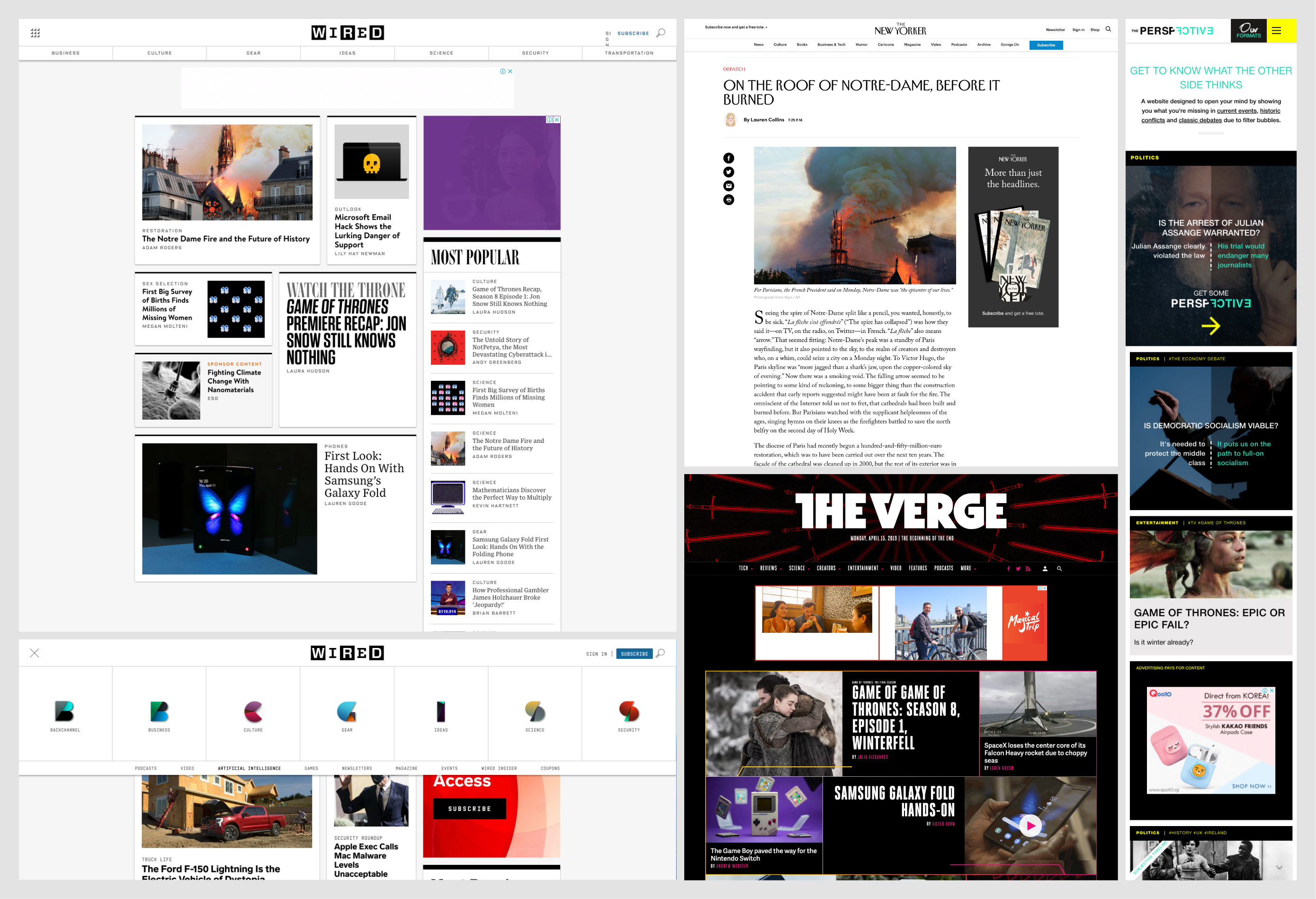
Here is a summary of the issues found:
- Clean, organized and visually pleasant layout.
- High resolution photos to accompany articles.
- Homepage first shows a “Featured” block, then articles are categorised further down.
- Most sites have the category within the article card.
- Article pages have clear clickable tags/categories at the top.
- Similar articles to the current article are recommended at the end of the article.
Based on the earlier UX expert evaluation, AsiaOne has already implemented several of these patterns found in the competitors’ websites. By building on AsiaOne's websites areas of strengths while correcting its areas of improvements, we can increase AsiaOnes ability to optimise for a better experience.
User Interviews
Next, I conducted user interviews to gain insights from news readers on their reading behavior.
For recruitment, I posted screening questions on AsiaOne using HotJar and contacted the shortlisted candidates to ask for user interviews. We also recruited some non-AsiaOne readers through social media.
Interview guide (flexible according to participant response):
- How many times do you consume news per week?
- Where do you consume your news?
- When do you consume your news?
- Which device do you consume your news on?
- Are there triggers for you to read the news? (notification, WOM, friends)
- What news topics interest you?
- What do you think is key in a news website? What do you think gives a website credibility?
- Have you ever subscribed to a newsletter?
- What are your first impressions of asiaone. What other websites do you read from.
- What other applications/websites do you use and show us why you use theses sites.
Affinity Mapping
Affinity mapping was used to synthesize the findings. An excerpt of the process is shown below where I grouped the problems found. Following which I generated a research report for the client, the summary is given below.

Key Findings:
- Impression of credibility was mixed.
- Some existing readers felt that AsiaOne is credible because of the sources of the articles & the parent companies (MM2/SPH).
- Other readers felt that AsiaOne is not 100% credible because the homepage looks like a typical layout used in wordpress/lifestyle blogs and “spam” sites.
- Frequent readers return to Asiaone because “it is a collection of news from everywhere” and thus don’t need to visit multiple sites.
- 7 users (33%) commented that they tend to avoid the homepage as the page is not updated frequently enough and that the homepage is too messy. Instead they go to the category pages immediately upon entering.
- While some users wanted news based on headlines, other users preferred particular content types.
- AsiaOne users wanted to read news, entertainment, lifestyle and digital articles.
These findings gave me new insights and helped me to scope the solution on how to improve the AsiaOne website.
The Main Aims of the Redesign
1. Build credibility by:
- Improving the visuals through adjusting the page layout & improving the brand design.
- Adding news sources on the article cards.
2. Improve at-a-glance information by adding categories to article cards. This helps aid users in the reading selection process.
Design
Design & prototyping was done on Adobe XD. At each design version I got feedback through usability testing.
Article Cards
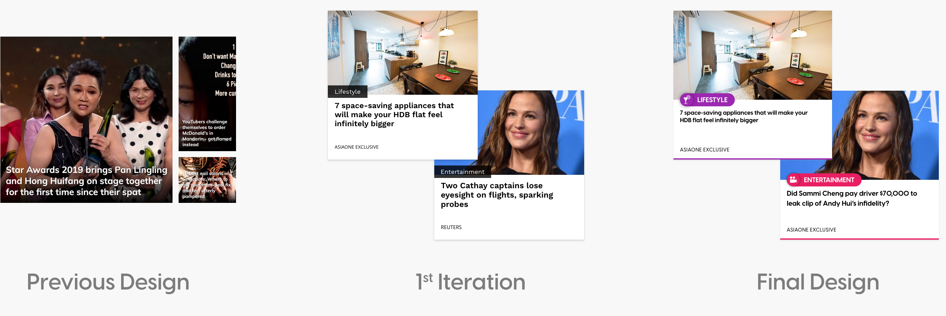
1st Iteration:
- Added categories to aid in glanceable information.
- Added article source to increase credibility.
- Images adjusted for a more consistent image ratio to avoid pixelation of photos.
Final Design:
- Introduced new visual branding — category colors and icons.
Homepage
Iteration 1:
- Utilised the new article design
- Category section was restructured from 2 categories (Lifestyle, Homeworks to 4 categories (News, Entertainment, Lifestyle, Tech & Games) to better reflect the content of Asiaone.
- Added “Trending” and “Latest Section” based on multiple user feedback that there were too few articles presented in the homepage for continuous reading.
Final Design:
- Introduced new visual branding.
- Reorganised the trending & latest sections as some users missed the section due to its placement.
- Video section made more prominent as it was easily missed during the previous usability test
- Added instagram feed to build social media presence.
Navigation Bar
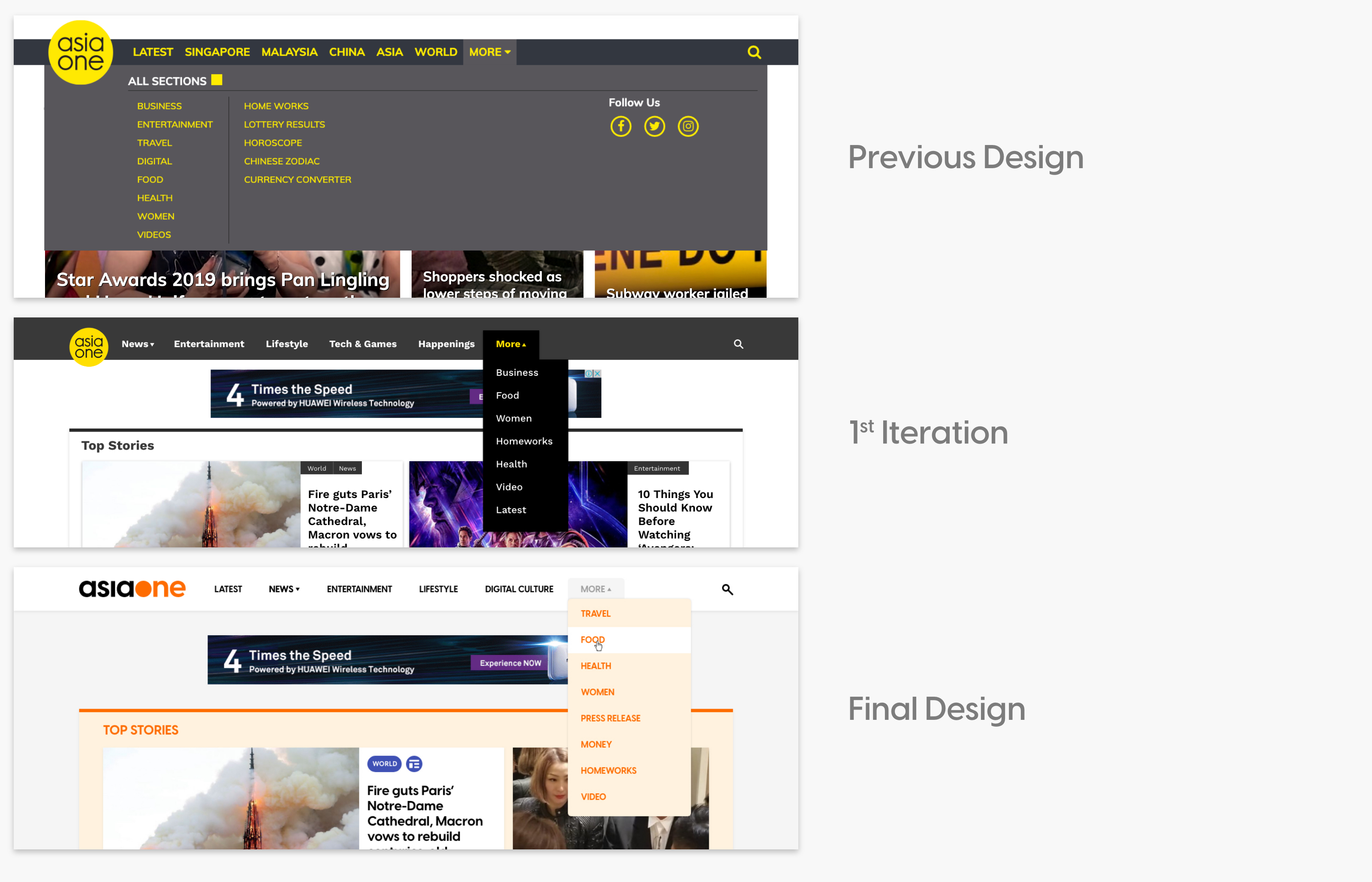
1st Iteration:
- Replaced regions in the main nav bar with categories. These categories were prioritised by user behavior and AsiaOne content.
- Remaining categories were put in a drop down menu.
Final Design:
- Introduced new visual branding.
- Added “Latest” section into the main nav bar as some users noticed that it was missing and was a page that they frequently visited.
- Was generally well received, users liked that the navigation was more well segmented.
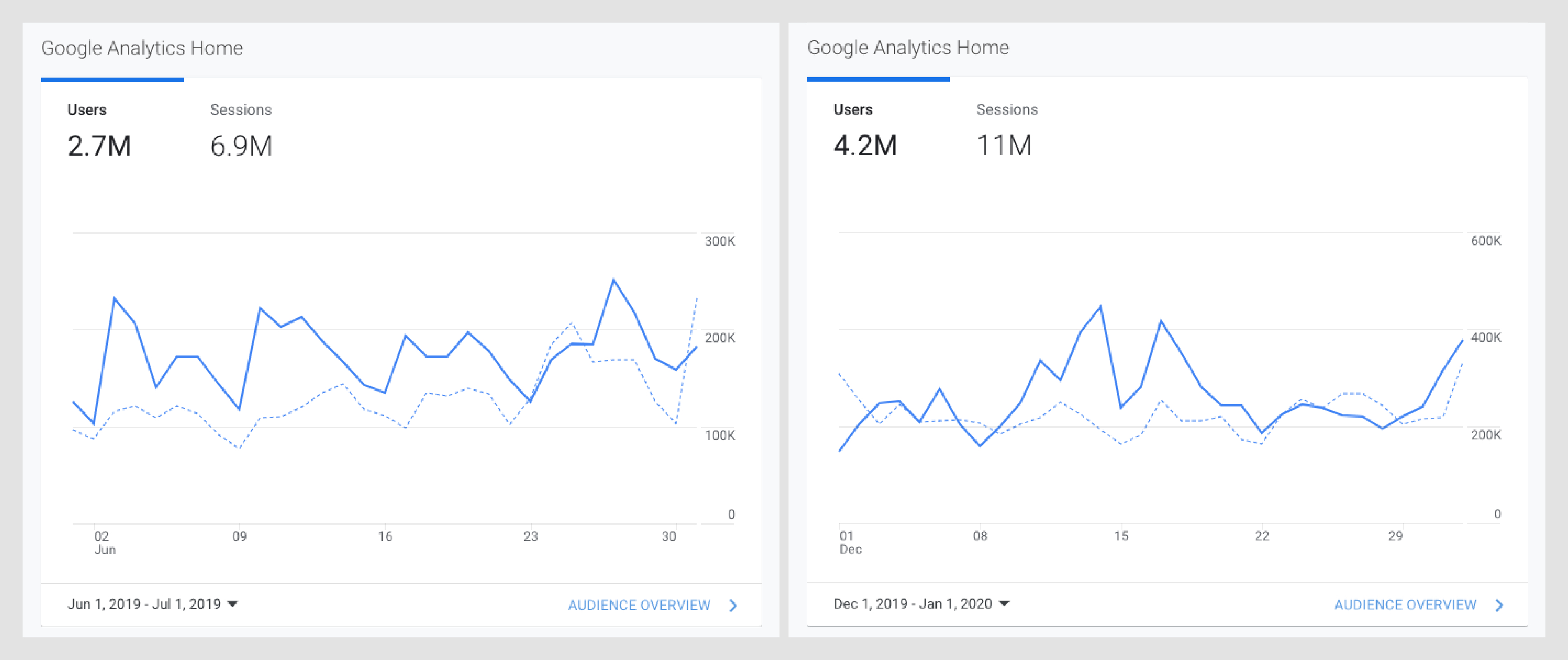
Results
Below shows the statistics 3 months before vs 3 months after the launch. Both users & sessions have gone up by 160%.